
The reality of income inequality

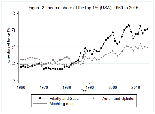
Most economists agree that income inequality has increased, especially in the United States. Testimony to this consensus is the popularity and the praise heaped upon Emmanuel Saez and Thomas Piketty for their work, which measures the level of inequality. Their work has cemented the idea of a U-curve of inequality whereby income inequality fell from high levels in the early 20th century only to surge again since the early-1980s. This can be seen in the first chart below. As one image can often convey a thousand words, their work has provided one of the strongest impetus for policies to alleviate inequality.

However, how accurate is this portrait? In recent years, many have started to question the amplitude of the increase since the 1960s and the most recent efforts suggest that the levels observed in the first half of the 20th century are exaggerated. Yet, these waves of new research are largely ignored even though they are crucial to the rationale underlying many policies aimed at reducing inequality.
Inequality since 1960
Many studies of income inequality, not only those that pertain to the U.S., use tax data. This means the income reported on tax returns is used to measure income. However, reported income is not the same as total income. There are important differences in the evolution of income measured via gross domestic product (GDP) and income measured via tax records. Many households, especially those at the bottom of the income distribution, receive important transfer payments (e.g. unemployment insurance, public pensions and other safety net payments) and in-kind compensation (e.g. employer-provided insurances). While tax data captures some of those transfers, it misses a large number of them—especially those in-kind (a problem which is especially acute in the U.S.). Once those sources of incomes are accounted for, especially since they weigh more heavily in the budget of households on lower rungs of the income ladder, the level of inequality is lower and the increase is heavily moderated.
More importantly, reported tax income is quite sensitive to changes in the tax code and in tax rates. If one looks closely at the chart above, one will notice a sudden and dramatic increase in a single year just after 1986. This, in the case of the U.S., resulted from a change in the wedge between corporate and personal income tax rates. Prior to a tax reform enacted in 1986, one rate was higher than the other and households with higher incomes simply declared some of their income as corporate income. After 1986, the reverse is true. The tax change incited a shift in the way income was being reported and, by accident, the income that is being measured for the purpose of computing inequality figures. Thus, there was an increase. This is only one example of distortions in the quality of the data. There are others. When some have tried to generate consistent measures, they find that the level of inequality pre-1986 is underestimated (i.e. the U-curve is not as deep) and that the increase is much more moderate (see second chart below).
Inequality before 1960
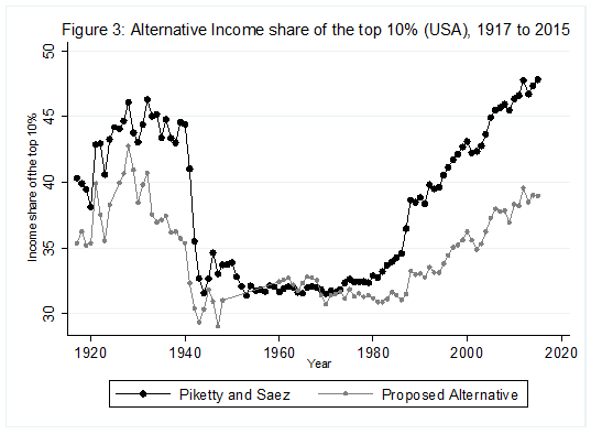
If the data after 1960 are fraught with complications, the data before 1960 are even more problematic. Systematic and careful data collection regarding incomes across the distribution really arose after the Second World War and was gradually improved. Anything prior to that period requires a great deal of care in the assembly of data. This is essentially what Piketty and Saez were believed to have done in their first foray in the measurement of American income inequality since 1917.
In work co-authored with Phillip Magness, John Moore and Phillip Schlosser, I found that there were three issues with the way that data was handled. Not that there was any foul play. All that was needed was a deep knowledge of the tax data (and tax code) since 1917.
The first is that, in the case of the U.S., the Internal Revenue Service (IRS) used to report income as “net income” prior to 1944. That measure takes the gross income reported by tax units and removes some itemized deductions (e.g. charitable giving, interest payments, state and local taxes etc.). This is a narrower measure than the one used from 1944 onwards which means that the two series are methodologically inconsistent and some adjustment is required. We found that the assumptions made by Piketty and Saez to harmonize the two series overstated the income share of the richest decile by close to two percentage points in some years (in years when that share stood between 35 per cent and 45 per cent of total income). Using actual data we collected from different IRS sources, we were able to make a correction for this issue.
The second is that prior to the 1940s, the income tax eligibility threshold was so high that, in many years, less than 10 per cent of U.S. tax units were required to even report an income. To arrive at income shares for the richest 10 per cent, there was a need to augment that tax series because of “missing tax filers.” To make that augmentation, Piketty and Saez used an ingenious solution—the use of a ratio of married to single filers from after 1940, when tax eligibility was expanded to almost all Americans making the issue moot. This was an ingenious solution, but they used the year 1942 to compute that ratio—a year when the Second World War caused a large influx of young single male filers onto the tax rolls. This distorted the ratios. Shifting to the last U.S. peace year, 1941, instead we found that the level of inequality was overestimated.
The third is that the income reported on tax returns need to be divided by the income of all citizens. We found that the justification for the denominator computed by Piketty and Saez was marred by an accounting error and by inconsistencies in terms of the tax unit population. To name only one example: prior to 1939, state and local governments employees were not mandated to file federal taxes and so they are not included in the tax population. Earlier researchers such as Simon Kuznets (a Nobel laureate) highlighted laborious steps to correct for this (and other) inconsistencies. Reconstructing national account from scratch using a wide array of archival sources, we found that Piketty and Saez understated by as much as eight percentage points (roughly one-fifth of the level of inequality they measured).
A different portrait and different implications
Once assembled with the other sources that pertain to the post-1960 era, we find a very different portrait of inequality. While it does fall and rise, it falls more modestly from a lower level. The subsequent increase is also more modest. Instead of looking like a U-curve, the evolution of income inequality looks more like a shallow tea saucer.
While some may believe this to be mere quibbling, that slight change speaks volume. First, it suggests that economic growth since the 1970 has been more equally shared than what some have argued. Second, it suggests that the fall in inequality to the 1960s may be wrongly attributed to strong government intervention meant to reduce inequality. We know that there were natural market forces at play in levelling inequality in most western countries until the mid-20th century.
For example, most countries (including the U.S.) saw regional disparities lessened so that the poorest regions grew faster than the richest regions. This occurred as capital moved to where the returns from increasing productivity were the greatest and as workers moved to where productivity was the greatest (i.e. capital moved to poorer places and workers moved to richer places). If there was a small reduction in inequality but that the natural market forces remained of equal importance, then the relative importance of government policies is diminished.
Overall, this means that the trend in income inequality for the U.S. over the past 100 years is substantially softened. To the extent people were using the Saez-Piketty data to justify more substantial redistribution, this research should give them pause. Before jumping on the “redistribution” bandwagon, we ought to carefully examine what is actually happening to inequality and why.
Author:
Subscribe to the Fraser Institute
Get the latest news from the Fraser Institute on the latest research studies, news and events.